
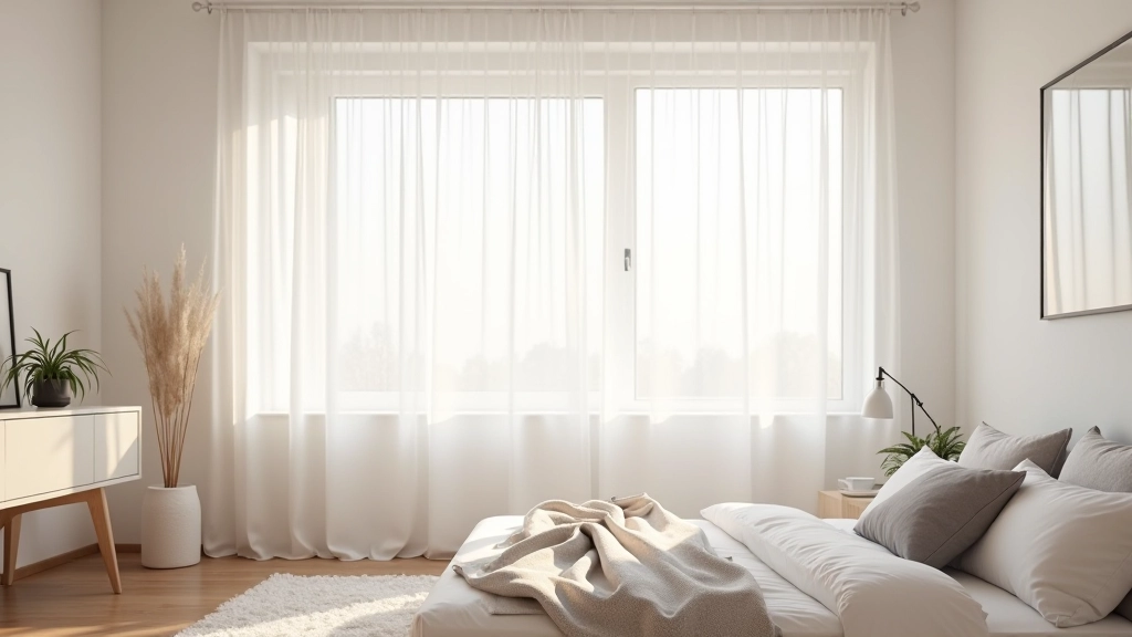
Light-Reflective Colour Palettes for Latvian Interiors
Which colours actually reflect light best? Learn the science behind cream, pale yellow, and soft grey for brighter spaces.


Why Colour Matters More Than You Think
Here's the thing — during Latvia's short winter days, every bit of light counts. We're talking about six, maybe seven hours of daylight at best. That's not much time for natural light to transform your space.
But colour? Colour can change everything. The right palette doesn't just make your home feel brighter — it actually bounces more light around the room. We're not talking about painting everything white. That's boring and honestly, it doesn't work as well as people think.
The science is straightforward. Light colours reflect between 60-90% of incoming light, while darker tones absorb it. But there's an art to choosing colours that feel warm and inviting while still maximizing reflectivity. That's where most people get stuck.
01
Cream and Off-White: Your Best Starting Point
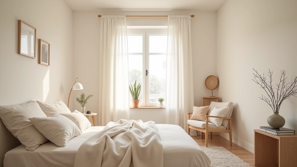
Cream isn't boring — it's strategic. This colour sits somewhere between pure white and warmer beige, giving you the reflectivity without the clinical coldness. In Latvian homes, cream works especially well because it reflects about 75-80% of light while still feeling comfortable and lived-in.
Off-white variations like ivory or eggshell are equally effective. They're subtle enough that you won't get tired of them during those long winter months when you're spending more time indoors. Pair cream walls with white ceilings and you've created a light-bouncing system that works all day.
02
Pale Yellow: Adding Warmth Without Sacrificing Light
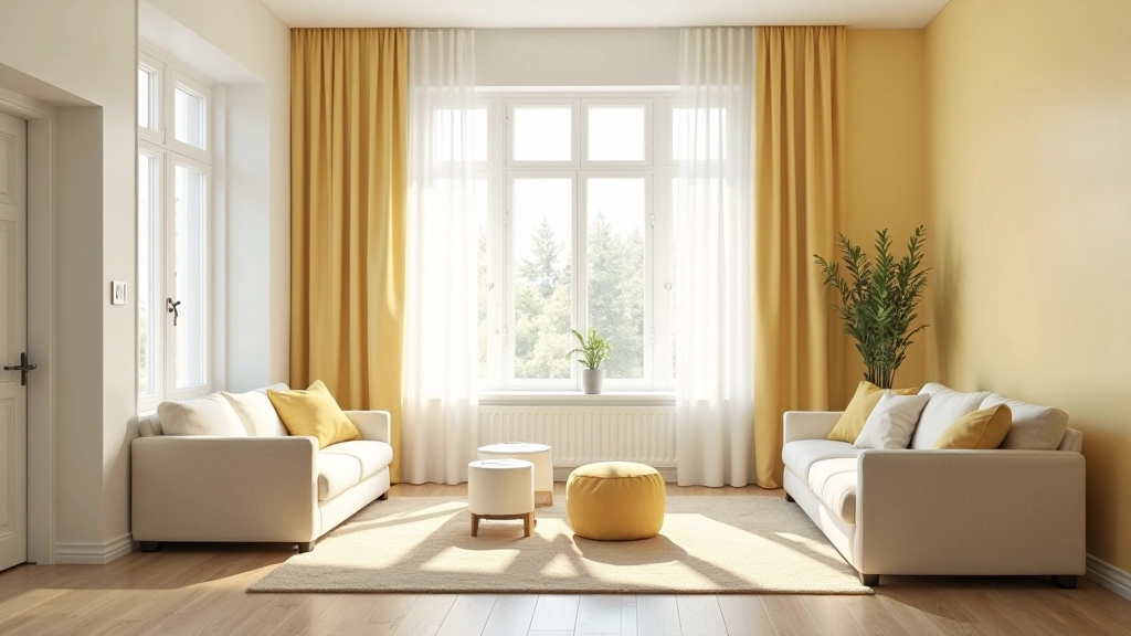
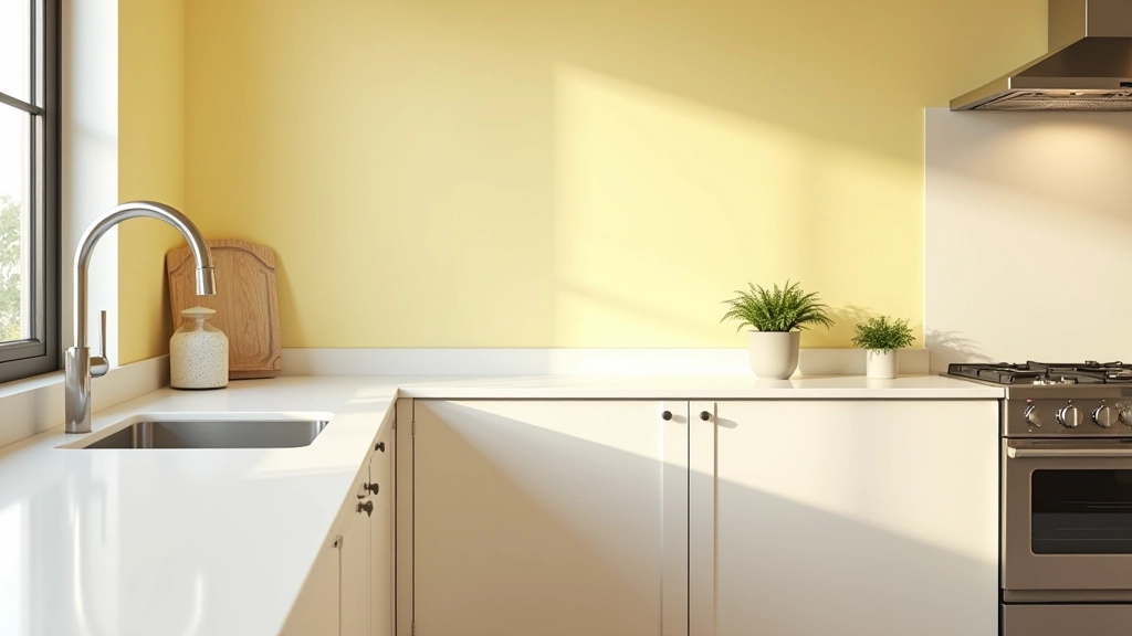
Pale yellow is where science meets comfort. It reflects about 70-75% of light — nearly as much as cream — while adding psychological warmth that's crucial during dark winters. Soft buttery tones or barely-there lemon yellows work best. You're not painting walls the colour of a highlighter pen.
In practice, this means that morning light gets amplified and spread throughout the room. The yellow undertone catches sunlight in a way that makes even cloudy days feel slightly less grey. It's a small shift, but after weeks of short daylight, that matters.
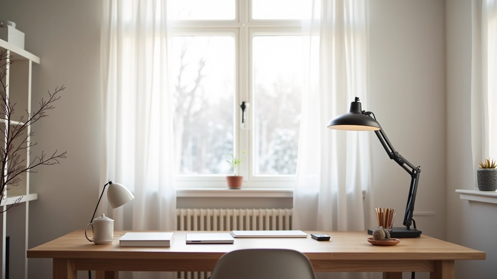
Use pale yellow on accent walls or in spaces where you spend most mornings — kitchens, home offices, living rooms. Save the cream for bedrooms where you might want slightly more neutral tones.
Educational Information
This article provides informational guidance on colour selection for interior light optimization. Light reflectivity percentages are based on general paint industry standards. Results vary depending on paint finish (matte vs. gloss), room orientation, window size, and existing décor. We recommend consulting with a professional interior designer for personalized recommendations for your specific space.
03
Soft Grey: The Sophisticated Reflector
Grey has a reputation for being cold, but soft grey — the really pale stuff, almost greige — reflects between 50-65% of light while feeling modern and sophisticated. It works beautifully in Scandinavian-inspired Latvian homes because it complements natural wood tones and minimalist aesthetics.
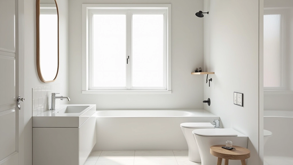
Light grey is particularly effective in bathrooms and hallways where you might not want warm yellow tones. It pairs perfectly with white trim and ceiling, creating subtle depth without blocking light. The key is staying in the very pale range — think barely-there rather than storm cloud.
Continue Learning About Natural Light
Making Your Choice
You don't need to repaint your entire home. Start with one room — maybe your living room or kitchen where you spend the most time. Choose cream if you want a safe, proven option. Go pale yellow if you want warmth without sacrificing light. Select soft grey if you prefer modern sophistication.
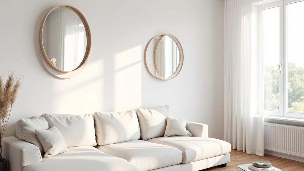
The real strategy isn't about picking one perfect colour. It's about building a system where cream, pale yellow, and soft grey work together across your space. Combine them with white ceilings, light-reflective finishes on woodwork, and those mirrors we talked about in other guides. That's when your Latvian home truly transforms during those short winter days.
Light-reflective colour palettes aren't just about aesthetics — they're about making your home feel more alive when daylight is scarce. And honestly, after weeks of darkness, that matters more than any design trend.